For optimal reading, please switch to desktop mode.
Introduction
Leonie is one of StackHPC's 2025 summer interns, working on improving the CloudKitty user
experience under the mentorship of Matt Crees and Pierre Riteau.
Task Brief
CloudKitty is an official
OpenStack project for Rating-as-a-Service. It keeps track of resource
utilisation by users, allowing operators to monitor resource usage in their
cloud, and potentially charge projects for this usage.
The CloudKitty Dashboard
provides a GUI to explore the results of CloudKitty.
The reporting dashboard included a static pie chart and graph demonstrating the
different costs of the metrics in the current project, for the period of the
current month, and the rating dashboard showed the ratings split by metric type
only. There were many limitations in the original dashboard, which we aimed to
improve on, for example you can only view the current month (meaning you're
unable to view past usage data). The dashboard also lacked the ability to group
results by different attributes, making it difficult for users to gain insights
from the data.
Overall, we aim to make additions to the Dashboard which provide a much more
in-depth user experience, with simpler ways to adjust the time period of the
data and group certain results by provided attributes.
Development Process
Isolated in a VM, we used DevStack to quickly set up an OpenStack environment to
develop and test our additions to the CloudKitty Dashboard. CloudKitty is
deployed by default with Ceilometer as the data collection service, and Gnocchi
for metric and resource aggregation. Rating data generated by CloudKitty is
stored in the time-series database InfluxDB.
In order to see variation in the data displayed on the graph, we found it best
to populate the database with randomised data that we generated ourselves.
CloudKitty defaults to using an older version of InfluxDB, 1.6.3,
which meant a lot of the 'easier' ways to import data were not yet introduced.
We managed to import data by using a text file in line protocol form, an
interestingly structured file, more details can be found in the InfluxDB Line Protocol Reference .
We wrote Python scripts to quickly generate a file full of randomised data, with
the tag and field keys/values necessary for each metric type. These can then be
exported to InfluxDB with the following curl command:
$ curl -i -XPOST 'http://localhost:8086/write?db=DATABASE_NAME' --data-binary @file.txt
where file.txt is a textfile written in line protocol form.
Changes
Datepicker
The datepicker
is used to improve control over the data displayed in the dashboard. The
datepicker implemented is similar to one in another part of the Horizon Dashboard.
It uses Bootstrap Datepicker
, which combines Bootstrap and jQuery to provide an interactive datepicker
widget in the Bootstrap style. In addition to the start and end datepickers, we
have also included preset ranges under some neat dropdown buttons, with the
ability to traverse to the previous/next range using a set of arrows (e.g. if
week is selected use the right arrow to go to next week). We made sure to enable
the Today button within the Datepicker widget, to allow for quick selection.
When combined with a Django form, it is easy to fetch the data in the time
period requested, by using the form fields and passing these into the CloudKitty
API calls.
This video demonstrates the datepicker functionality, including the preset
ranges and arrows to traverse to the previous/next range.
Interactive Legends
An interactive legend has been added to both the d3 pie chart
and the Rickshaw graph. Both allow
you to hide certain metrics, and the Rickshaw graph also allows for reordering
(layers) of the data and highlighting the metric that is currently being
hovered over (on the legend). Animations have been added to the pie chart for
when metrics are added/removed.
Hover-over Labels and Percentages for Pie Chart
In addition to the interactive legend, we thought it would be useful to display
the percentage that a metric takes up, which shows when you hover over the
segment. An extended hover displays the metric name.
This video demonstrates the animations and hover-over behaviour for the pie chart.
Upgraded Admin/Rating Panel to Use v2 API
The admin rating panel has been upgraded
to use v2 of the CloudKitty API, to match the project/rating panel. This allows
for filtering and increased customisation of the API call,
providing more detailed responses.
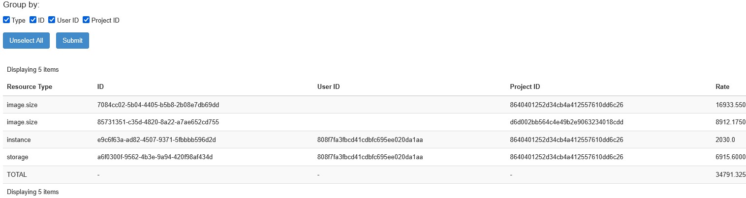
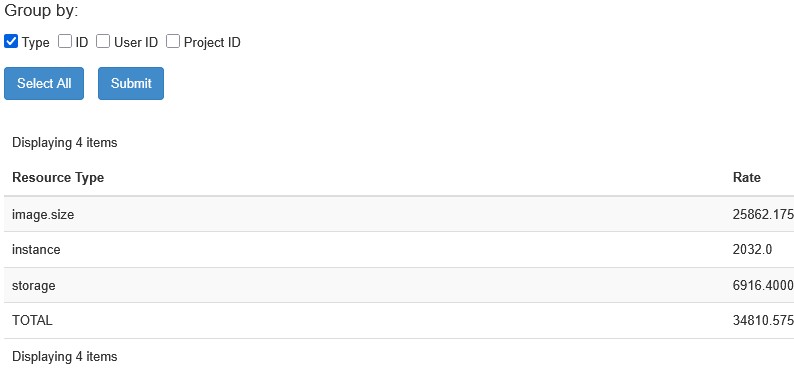
Grouping Functionality
For both rating panels, which by default display the breakdown of rates by Resource Type,
the ability to group the ratings by certain attributes (which are configurable)
has been added.
This is achieved by using a custom form and a set of checkboxes. ['Type'] is set
to be the default if no list has been provided in the configuration.
CI/CD Improvements
Having learned more about the internals of CloudKitty, we also looked beyond the
user experience to contribute improvements to CI/CD in the upstream project.
Since StackHPC deploys Prometheus as the default
fetcher and collector for CloudKitty for many customers, we extended the
CloudKitty DevStack integration to support it. Changes were made to devstack-plugin-prometheus
and the CloudKitty CI/CD configuration.
To fully support Prometheus, we needed to ensure that openstack-exporter was
also set up, which is done within the devstack-plugin-prometheus project. This
ensures that Prometheus is deployed in DevStack, and that the CI tests are run
with Prometheus as the fetcher and collector.
Future Steps
As we worked on the dashboard, we found a few areas that could be improved
further, for example the localisation. Our priority would be to work on the
timezone handling, as currently only UTC times are supported. This change would
hopefully support users in a wider range of locations, and improve the general
experience further. It would also be great to improve the dashboard tests,
as there seem to be very few of these at the moment. A more robust testing
process would ensure that future changes do not break existing functionality.
Conclusion
Overall, the improvements to the CloudKitty Dashboard provide a much more
in-depth user experience, with simpler ways to adjust the time period of the
data being viewed. The new datepicker widget, interactive legends, and
grouping capabilities all contribute to a more intuitive and efficient
workflow for users.
Get in touch
If you would like to get in touch we would love to hear from you. Reach out to
us via Bluesky,
LinkedIn or directly via
our contact page.